
Unpacking the Autograder: What Test Case Data Reveals About Student Learning
Analyzing 1.4 million test case outcomes to understand where students struggle, how they recover, and what they break along the way.
When students submit code to an autograder, they get back a score. Maybe a 73%. Maybe a list of which tests passed and which failed. They fix something, resubmit, and hope the number goes up.
As instructors, we see something similar: a gradebook full of final scores. But those scores compress an enormous amount of information. A student who scored 80% on a programming assignment might have aced the core logic and missed every edge case, or they might have nailed the edge cases while fundamentally misunderstanding the data structure they were building. Two students with identical scores can have completely different gaps in understanding. The final number does not tell us where students struggled, how long they stayed stuck, or whether they actually learned from the iteration process we are counting on. I wanted to look deeper than the gradebook.
The data for this analysis comes from a single, week-long programming assignment called Naive Database (a C++ project where students build a simple database with tables, columns, and rows) from the Spring 2023 offering of CS 128 at the University of Illinois. Across 933 students, the autograder recorded 18,655 gradable submissions evaluated against 77 test cases. That is over 1.4 million individual test outcomes, enough data to identify meaningful patterns in how students approach and learn from a complex programming assignment.
Data Collection and Analysis Pipeline
PrairieLearn, one of the platforms we use in CS 128, records every submission a student makes, not just the final one. Each submission includes the result of every individual test case: which passed, which failed, and with what score. This is a rich dataset, but PrairieLearn’s built-in analytics do not expose it at the per-test-case level.
To access this data, I built a two-stage pipeline. The first script pulls raw submission data from PrairieLearn’s API (every student, every submission, every test case result) and assembles it into a CSV where each column is a test case and each row is a submission. The second script takes that CSV and computes 15 different statistical measures: pass rate, discrimination, first-attempt performance, improvement rate, struggle patterns, learning curves, regression volatility, and hierarchical clustering, among others. Each metric was chosen to answer a specific pedagogical question about student behavior.
The results of this analysis are detailed in the sections that follow.
Test Case Difficulty Distribution
The 77 test cases span a wide range of difficulty. Pass rates below are measured on each student’s highest-scoring overall submission. At the top, default constructors and edge-case error handling show near-universal pass rates. 99.9% of students passed Database: default constructor, and Table: default constructor was close behind at 99.7%. At the bottom, memory management and deep copy operations proved far more resistant.
| Test Case | Pass Rate |
|---|---|
| Database: default constructor | 99.9% |
| Table: default constructor | 99.7% |
| Table: copy constructor (no rows; n columns) | 99.6% |
| Table: copy assignment operator and two empty tables | 99.5% |
| … | |
| Memory Check: Database Copy Constructor | 84.9% |
| Memory Check: Database Copy Assignment Operator #2 | 83.0% |
| Table: copy assignment operator (m rows; lhs > rhs) | 82.3% |
| Memory Check: Table Copy Assignment Operator #2 | 80.6% |
| Table: operator<< to table with (m rows; n columns) | 80.5% |
| Memory Check: Table Copy Assignment Operator #3 | 79.3% |
| Database: Copy assignment operator non-empty tables | 78.6% |
A 79% pass rate might not sound alarming on its own, but in a class of 933 students that represents approximately 200 students who never demonstrated mastery of copy assignment on non-empty tables, even on their best work.
Test Case Discrimination
Pass rate alone does not indicate whether a test case is useful for differentiating students who understand the material from those who do not. A test that everyone passes carries no signal. A test that is hard but randomly so, where strong students fail as often as weak ones, is noise. What is needed is a measure of discrimination: the degree to which a test case separates students who have mastered the underlying concept from those who have not.
We compute this as a corrected item-total correlation using Spearman’s rank correlation. For each test, we correlate its score with the sum of all other test scores, removing the test under analysis from the total. This avoids part-whole contamination (where a test appears discriminating simply because it contributes to the score it is being correlated against); additionally, Spearman’s rank-based approach is robust to the non-normal, often bimodal distributions typical of test case scores. The results sort cleanly by concept.
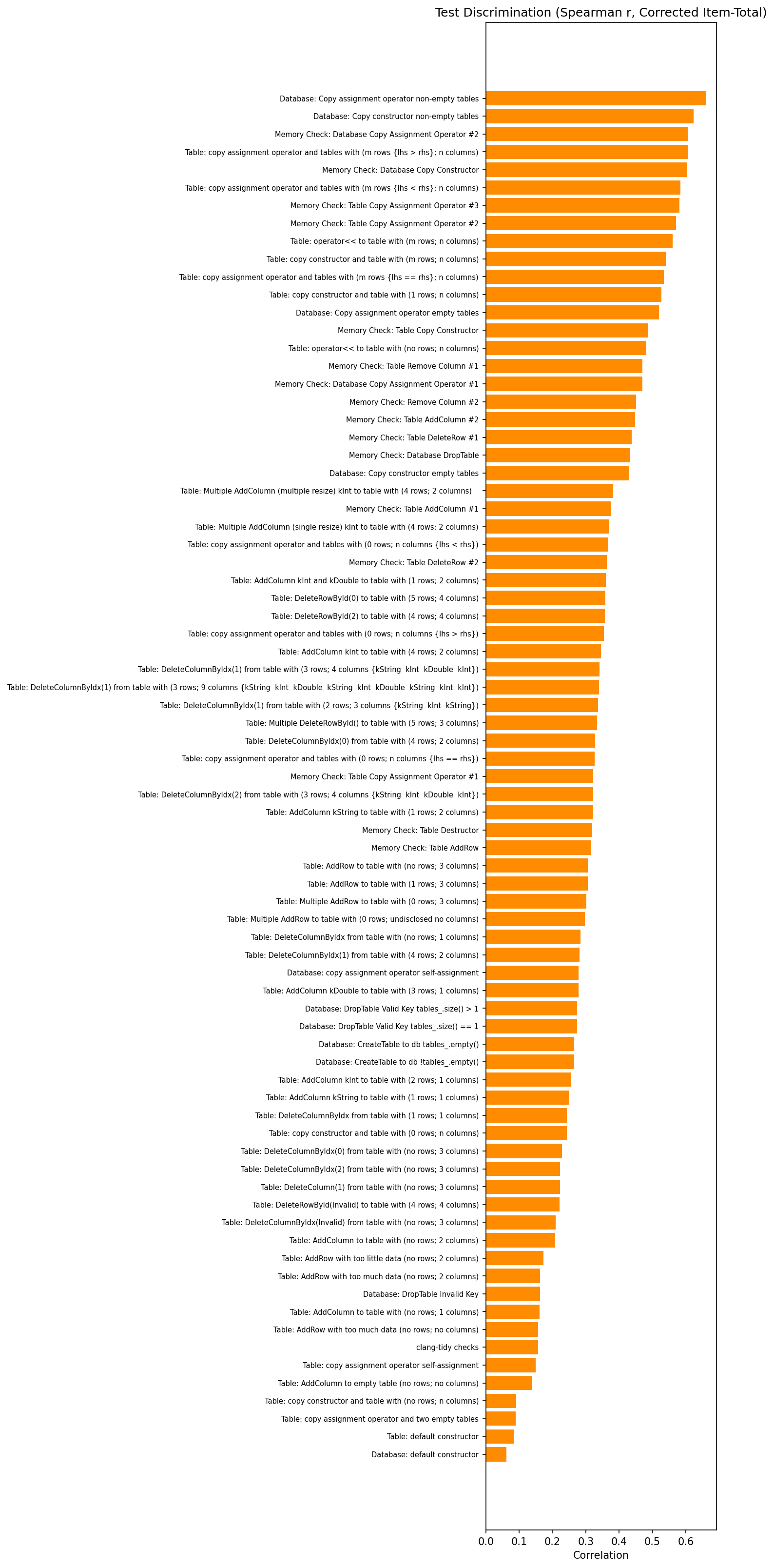
The highest discrimination values (r ≈ 0.6–0.7) belong almost exclusively to memory check and copy/assignment tests on non-empty data structures. Meanwhile, Table: copy assignment operator and two empty tables and Database: default constructor sit at r ≈ 0.1–0.2. These tests have 99%+ pass rates, so they provide almost no signal about student ability. This does not mean those tests are pointless (they validate basic functionality), but they should not be treated as indicators of understanding.
First-Attempt vs. Best-Submission Pass Rates
One of the core premises of unlimited-resubmission autograding is that students learn through iteration. To evaluate whether this premise holds, and for which concepts, we compare the pass rate on each student’s first submission against their best submission.
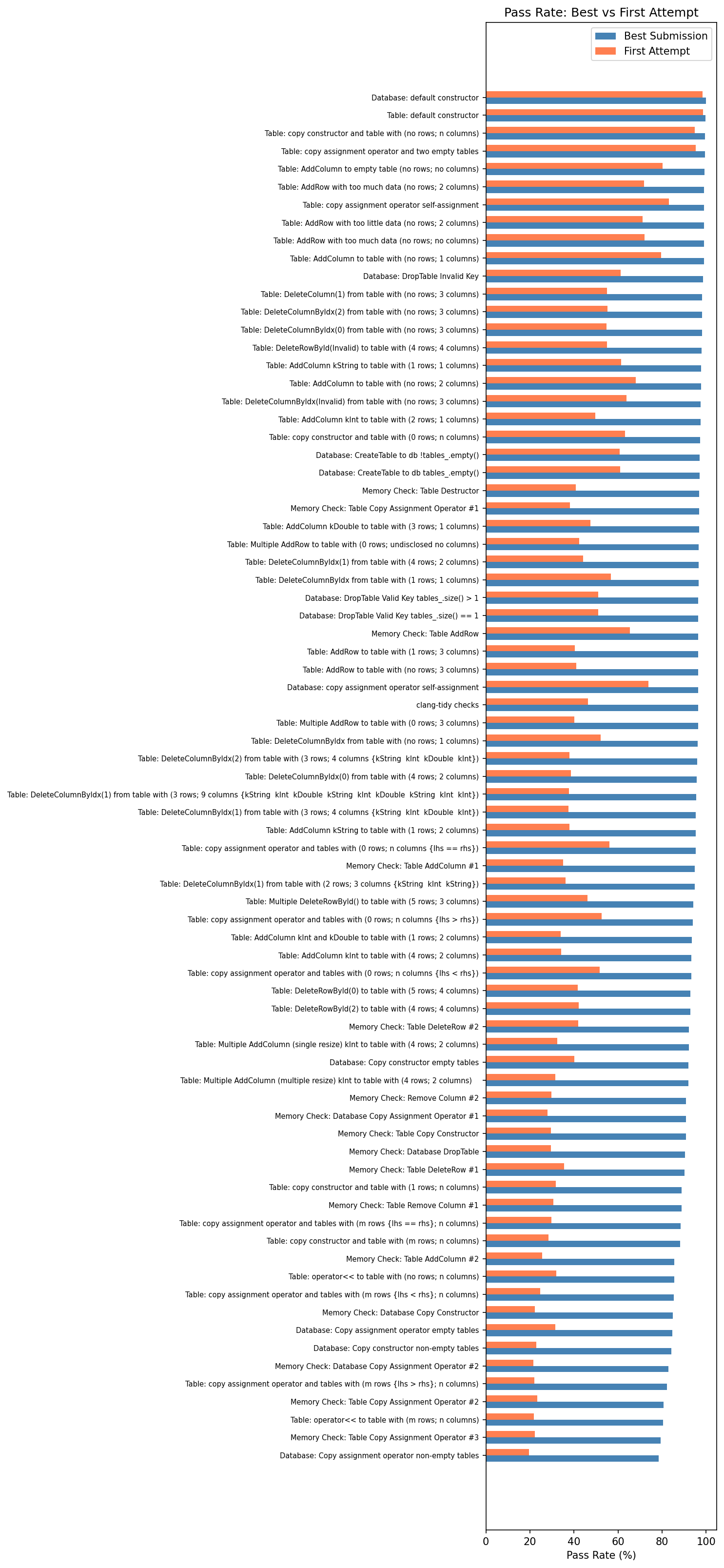
The hardest tests show dramatic improvement. Memory Check: Database Copy Assignment Operator #1 went from a 28% first-attempt pass rate to 91% on best submission, a 63 percentage point gain. Memory Check: Table Copy Constructor showed a similar jump: 30% to 91%. Across the board, the deep copy and memory management tests all started around 20–30% on first attempt and climbed to 80–97% by best submission.
This confirms that resubmission is doing real work for hard concepts: students who score poorly on these tests early in their submission history reliably improve by their best attempt. Whether that improvement reflects iterative learning or the fact that students defer harder concepts until later in their workflow (a possibility we examine below), the resubmission model is giving them the room to get there.
The easy tests, by contrast, show almost no gap. Database: default constructor is 98.3% on first attempt and 99.9% on best. The resubmission model is not needed for these concepts; students solve them on their first or second try.
Struggle Patterns and Strategic Deferral
Improvement rates tell us that students eventually learn, but they do not capture how difficult the journey is. To assess this, we track two struggle metrics: never-pass rate (the fraction of students who never achieve full marks on a test across any submission) and stuck-on rate (the fraction who score zero for three or more consecutive submissions).
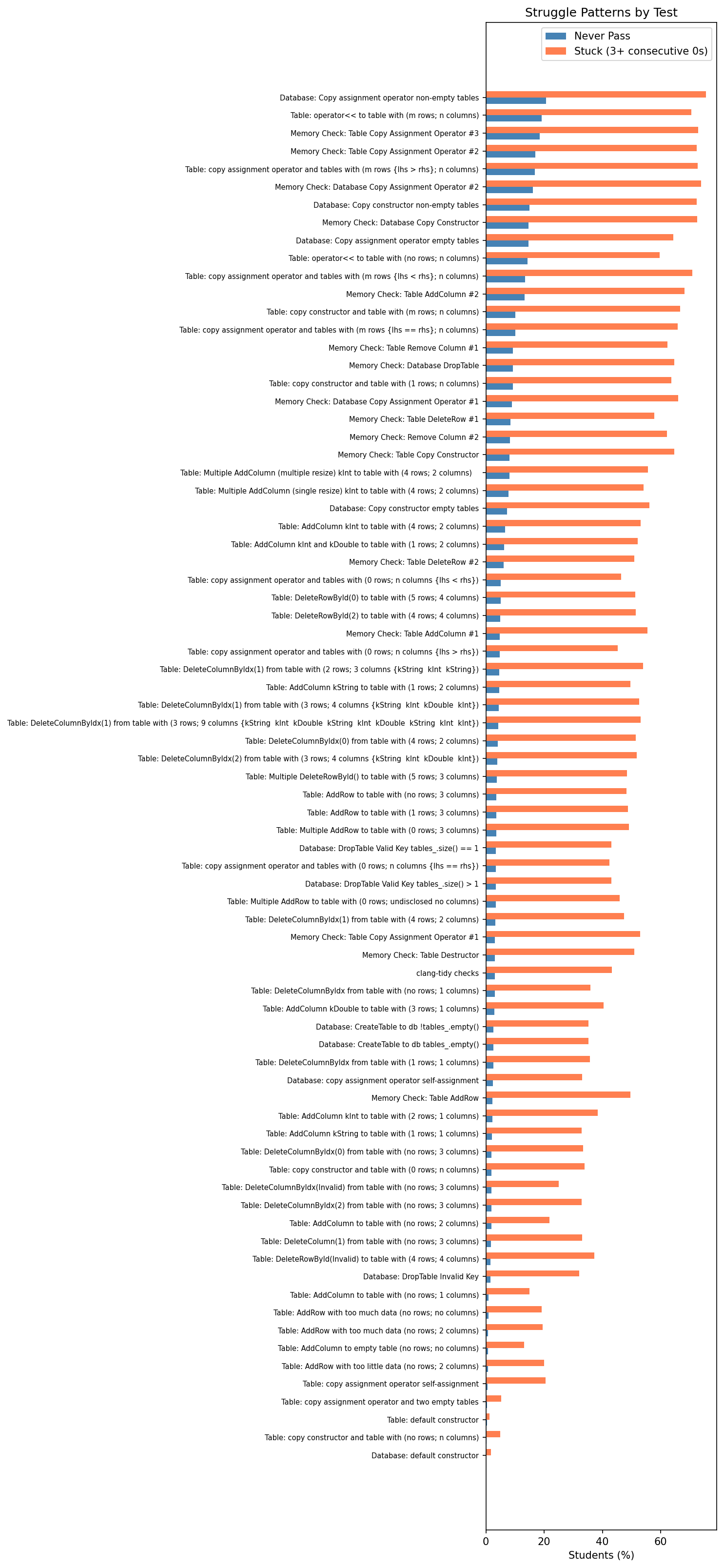
We found that 76% of students scored zero on Database: Copy assignment operator non-empty tables for three or more consecutive submissions. Nearly the same fraction exhibited this pattern on the database copy assignment memory check (74%) and table copy assignment operator tests (73%).
It is important to consider what this actually means. One interpretation is that these students were genuinely stuck, trying and failing repeatedly, unable to make progress. The other is more strategic: in an environment with unlimited submissions, many students use the autograder as a compilation and validation check. They submit to verify that the parts they are working on compile and pass, while intentionally deferring harder tests for later. Under this interpretation, a streak of zeros on the copy assignment operator does not mean a student is struggling with it. It means they have not started it yet.
The truth is likely a mix of both, and the learning curve data (below) supports this reading. The hardest tests do not show gradual, linear improvement; they show a sharp transition, consistent with students working on other parts of the assignment first and then tackling memory management and deep copy as a distinct phase. The fact that these tests cluster at the bottom of the learning curve (latest to improve) reinforces the idea that students approach the assignment in layers: basic functionality first, then correctness, then memory safety.
Either way, the pattern is informative. Whether students are genuinely stuck or strategically deferring, the data exposes how they mentally decompose a complex assignment; this has direct implications for how we design instruction and structure the test suite itself. We return to this in the implications section below.
Learning Curve Analysis
To visualize how student performance evolves over the course of their submissions, we construct a learning curve heatmap. Each student’s submission history is normalized to percentiles (so a student with 5 submissions and one with 30 are compared on the same scale), then binned into 10 deciles. The result is a heatmap where tests are arranged along the vertical axis, submission progress along the horizontal axis, and color encodes pass rate.
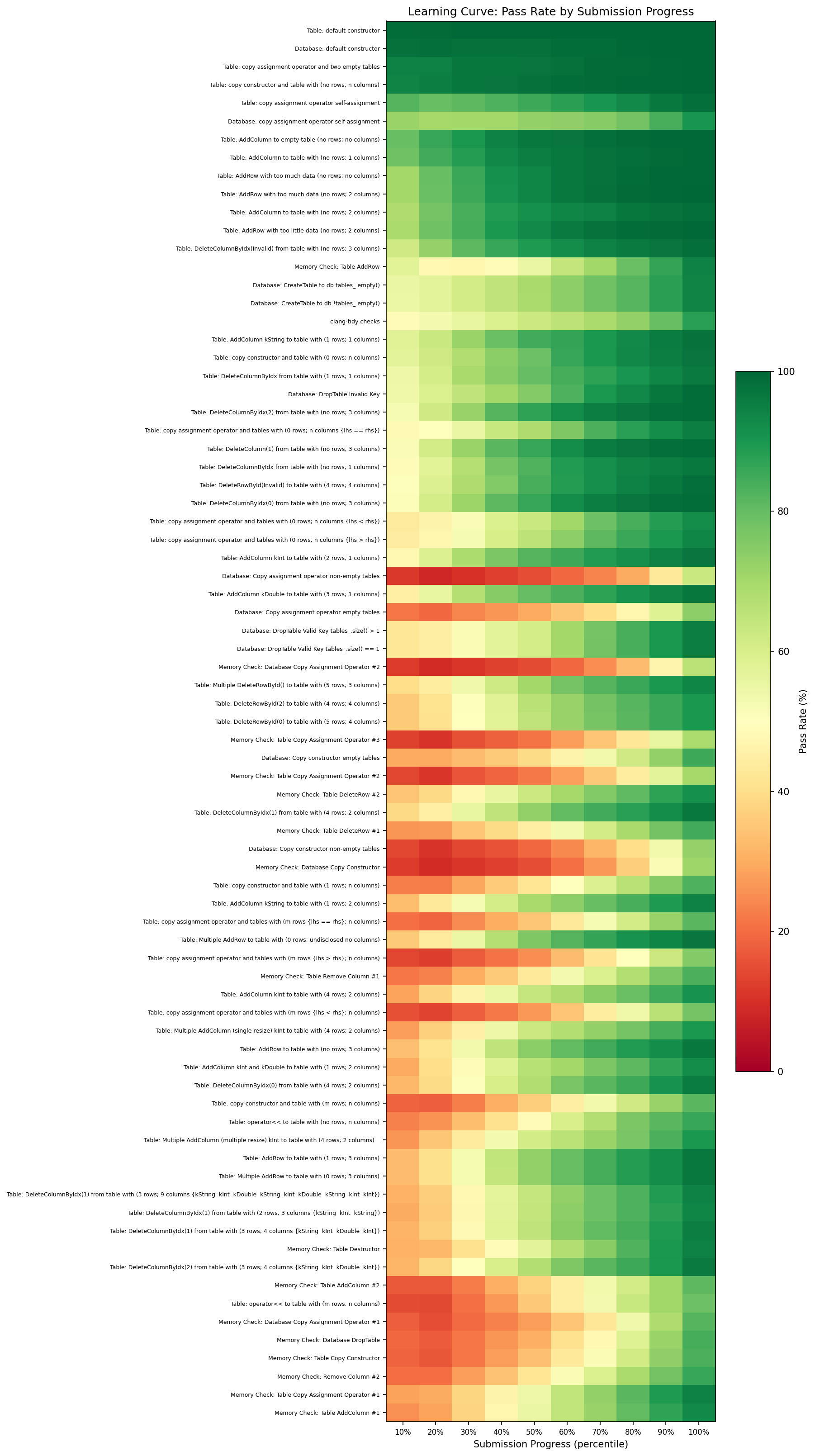
The patterns are immediately legible. The bottom of the chart is dominated by memory checks and copy operators: deep red on the left (students either have not attempted them yet or have not figured them out), transitioning to green on the right (by their later submissions, most students have figured it out). The biggest improver, Memory Check: Table AddColumn #1, shows a 67 percentage point swing from first decile to last, with Memory Check: Table Copy Assignment Operator #1 close behind at 66 points.
At the top of the chart, constructors and basic operations are green from left to right. Students solve them immediately and keep them passing; there is no learning curve because there is nothing to learn through iteration. Either the student knows how to write a default constructor or the course prepared them for it before they ever submit.
Regression and Volatility
One pattern the learning curve does not fully capture is regression: students who had a test passing and then broke it on a subsequent submission. This is especially common in C++ projects where modifying one function can introduce a memory leak or invalidate a pointer somewhere else.
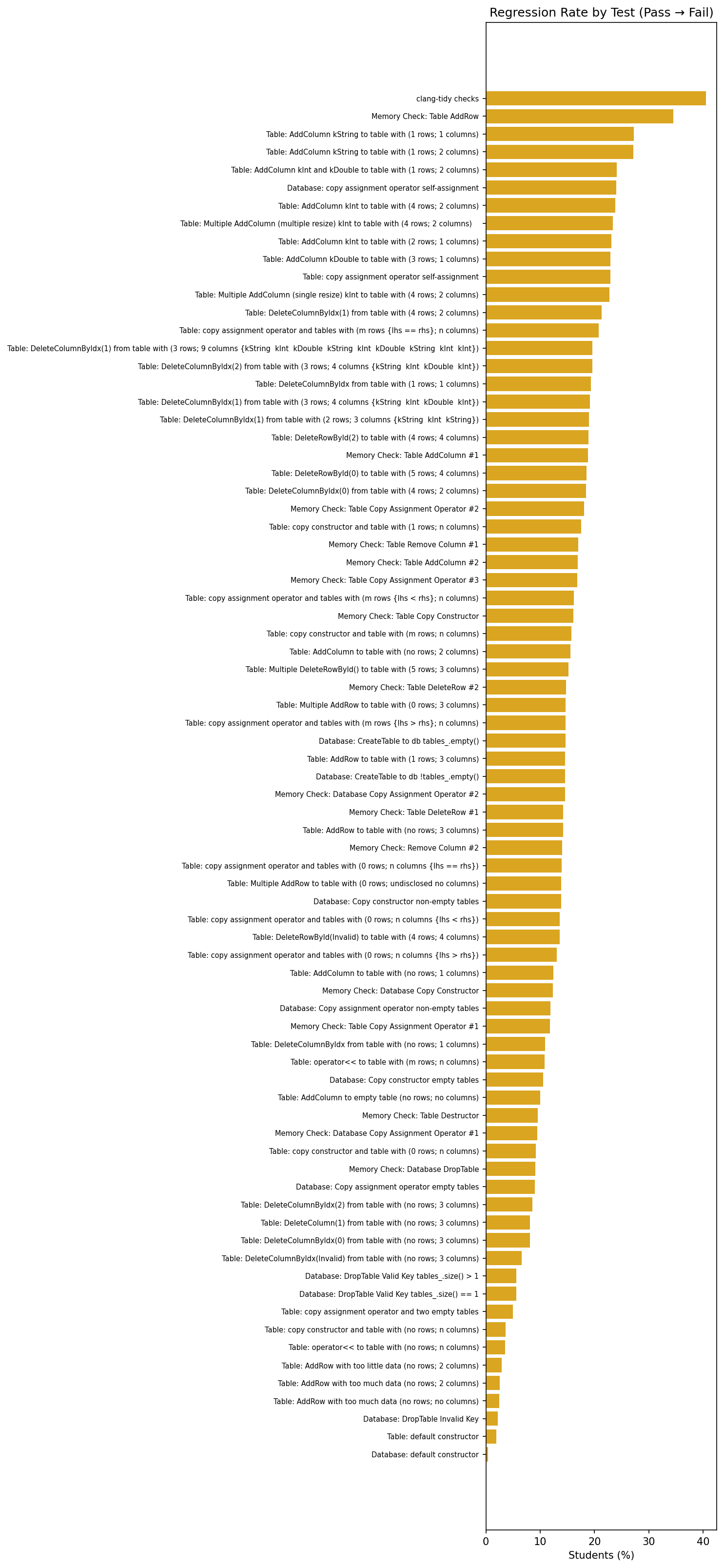
clang-tidy checks are the most volatile, followed by Memory Check: Table AddRow and AddColumn tests.Two in five students regressed on the clang-tidy style checks; they had clean code at one point and then introduced lint violations as they added new functionality, averaging 1.8 regressions each. This makes intuitive sense: style checks are sensitive to any new code, not just the code being tested. The second most volatile test, Memory Check: Table AddRow, saw a 35% regression rate. Students who had correct memory handling broke it when modifying other parts of their implementation. The third tier (23–27% regression) is dominated by AddColumn variants, suggesting that column-addition logic is particularly fragile across code changes.
High volatility does not necessarily mean a test is poorly designed; however, it does indicate that students need better feedback about what they broke, not just that something failed. A regression-aware autograder that reports “this test was passing on your last submission but is now failing” could save students significant debugging time.
Hierarchical Clustering of Test Cases
The final analysis clusters test cases by the correlation of their pass/fail outcomes across students. If students who fail test A also tend to fail test B, those tests are clustered together. We use hierarchical clustering to produce a dendrogram (showing which tests group together) paired with a correlation heatmap.
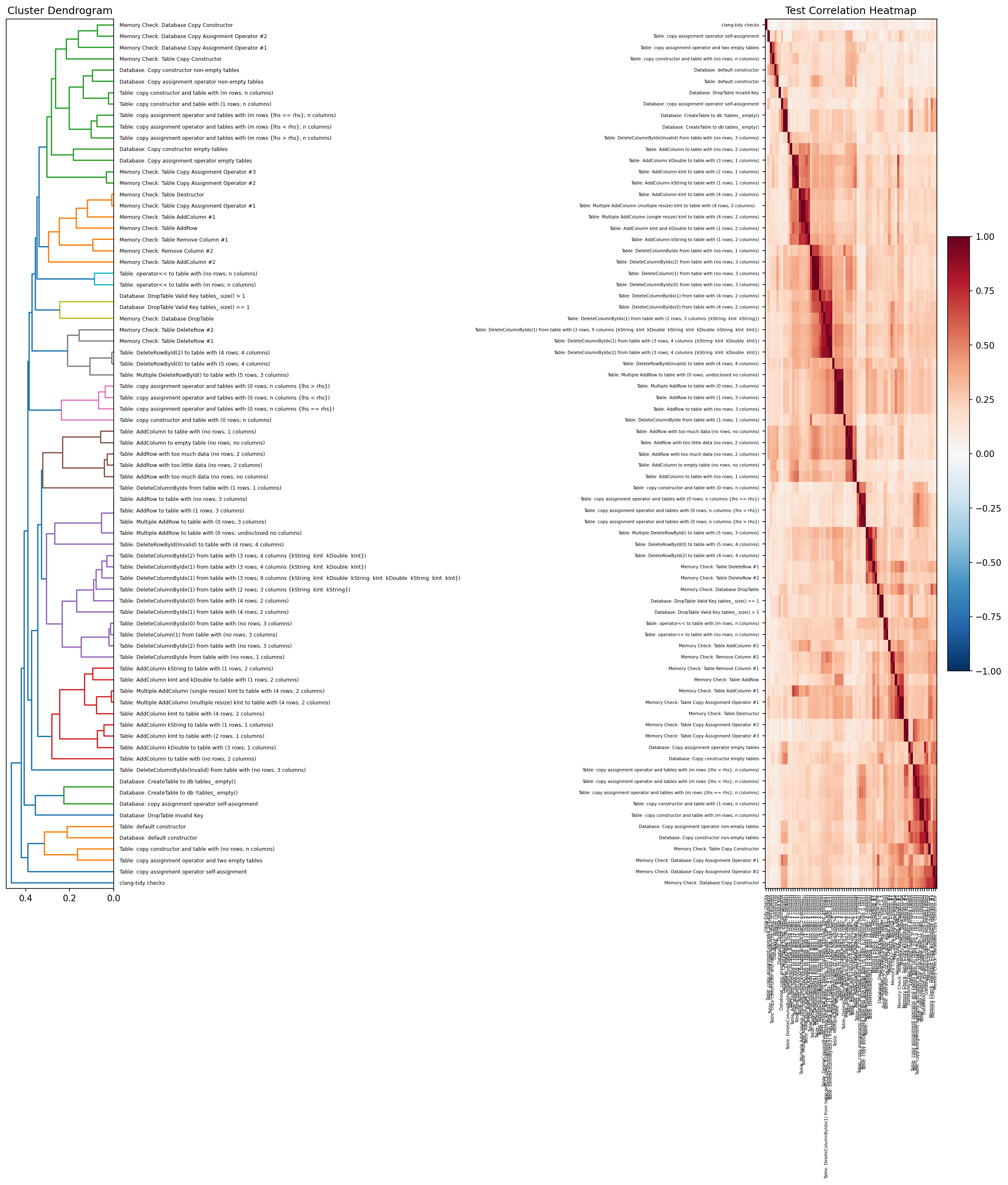
The clusters largely validate the assignment design: memory check tests cluster tightly together; copy constructor tests group with their corresponding assignment operator tests; and basic CRUD operations (AddRow, DeleteColumn) form their own cluster. The clustering also reveals redundancy: some tests are so tightly correlated that they are effectively measuring the same thing. This is useful information when trimming a test suite or deciding which tests carry unique signal for grading.
Implications for Instruction and Assessment
The metrics above are descriptive, but their value is prescriptive. They answer two questions that overall scores cannot: where should we focus our instruction, and is our test suite measuring what we think it is measuring?
Informing instructional priorities
The learning curve and struggle data reveal something that overall scores obscure: students approach this assignment in distinct phases. Basic constructors and CRUD operations are solved early and stay solved; copy semantics and memory management come last, often after long stretches of zero scores on the relevant tests. The fact that 76% of students scored zero on the hardest copy assignment test for three or more consecutive submissions, while 79% eventually achieved full marks, suggests that most students are encountering these concepts in earnest through the autograder rather than arriving prepared from lecture.
That is a direct signal about instructional sequencing. First-attempt pass rates of 28–30% on memory check tests do not necessarily mean the instruction is inadequate; concepts like copy semantics and memory management are difficult, and it is reasonable to expect that students need time and practice to internalize them. But the data tells us exactly where that ramp-up is steepest. It narrows the search from “scores are low” to “students need more runway on these specific concepts before they can apply them in a multi-class C++ project.” That specificity is what makes the data actionable: it points us toward where additional preparation — a targeted exercise, an earlier introduction, or a worked example that bridges lecture and practice — would give students a stronger starting point.
The discrimination metric sharpens this further. Memory management and deep copy tests discriminate at r ≈ 0.6–0.7, meaning performance on these tests is strongly correlated with overall assignment mastery. These are the concepts that separate students who understand the material from those who do not. If we have limited time to add a review session or a supplementary exercise, the discrimination data tells us exactly where that time will have the most impact. Conversely, the constructor and edge-case tests that sit at r ≈ 0.1–0.2 are not where the learning gaps live; spending instructional time on those topics is unlikely to move the needle for students who are struggling. Combining discrimination with point weight makes the case even more concrete: a 10-point test with a 50% pass rate affects student grades far more than a 1-point test that only 10% pass. Multiplying each test’s failure rate by its point value produces a simple priority ranking for where to target lecture time, hints, and office hours.
Evaluating test suite quality
The same data that tells us about students also tells us about the test suite itself. A good test suite should cover the relevant concepts, distribute its signal across distinct skills, and allocate points in proportion to importance. Several of the metrics in this analysis function as a diagnostic for whether a suite meets those criteria.
Discrimination is the most direct measure. When a test has a 99% pass rate and r ≈ 0.1, it carries almost no evaluative signal. If that test is worth 5 points and a high-discrimination test is worth 2, the point allocation is working against us: the grade is being driven by tests that do not reflect understanding.
Clustering extends this from individual tests to the suite as a whole. When two tests are so tightly correlated that students almost always pass or fail them together, they are effectively measuring the same thing. The hierarchical clustering in this analysis shows exactly these patterns: groups of memory check tests that move in lockstep. This does not mean we should delete one of them; redundant tests can serve as a safeguard against implementation-specific edge cases. But it does mean we should be aware that our 77-test suite may be measuring fewer than 77 independent skills, and the apparent breadth of coverage may be narrower than the test count implies.
Volatility raises a different kind of question. Tests with high regression rates — where students pass and then fail on subsequent submissions — may be measuring implementation fragility rather than conceptual understanding. The clang-tidy checks are a clear example: 40% of students regressed on them, not because they forgot how to write clean code, but because adding new functionality introduced new lint violations. This is something we should evaluate when designing our test suites: whether a high-volatility test is rewarding understanding or penalizing the iterative process we are asking students to follow.
These diagnostics gain the most value when tracked over time. Improvement rates serve as a health check on the iterative submission model: the 63-point gains on memory management tests confirm that resubmission is doing real work for those concepts, but if a future analysis shows a test with low improvement despite heavy resubmission, something about the feedback loop is broken. Running the same analysis across Fall and Spring offerings creates a before-and-after framework for measuring whether changes to the course or the test suite actually helped. Did restructuring the assignment reduce the stuck-on rate? Did reweighting the point allocation shift the discrimination profile? The per-test-case data can answer these questions at a granularity that overall scores never could.
Limitations
There are several limitations to acknowledge. This analysis examines a single assignment from a single semester. While the sample size is large (933 students, 18,655 submissions), the patterns observed may not generalize to other assignments, other semesters, or other courses. The stuck-on rate metric cannot distinguish between genuine struggle and strategic deferral without additional data (e.g., time-on-task or IDE telemetry). The discrimination metric uses a corrected item-total correlation within the assignment, which means it measures correlation with assignment performance rather than with any external measure of understanding. Finally, submission count serves as a proxy for effort, but students who solve problems offline and submit fewer times may be undercounted by metrics that depend on submission volume.
Conclusion
Autograders generate an extraordinary amount of data that mostly goes unused. We reduce it to a single score per student and move on. But behind every score is a submission history that tells us two things we cannot get from the gradebook: where to focus instruction, and whether our test suites are measuring what we think they are measuring. The concepts with high discrimination and low first-attempt pass rates are where the learning gaps live; the redundant clusters, misaligned point weights, and high-volatility checks are where the assessment itself needs attention.
The pipeline described here is not specific to this assignment or this course. Any autograder that records per-test-case results on every submission is generating the same raw material. Making it legible does not require machine learning or complex infrastructure. It requires asking specific pedagogical questions and writing the code to answer them.